
Tag: comics
-
Tom Strong Compendium, by Alan Moore and Chris Sprouse

I’m sloooowly winding my way through the Tom Strong Compendium by Alan Moore and Chris Sprouse, which collects the entire Tom Strong run that floated across a couple of publishers during it’s initial debut. I remember picking up a few of these issues in pamphlet form when they first debuted 25 years ago, but didn’t…
-
unlimited wonder comics lab january challenge day 9

unlimited wonder comics lab january challenge continues with day 9 prompt: shark i’m running with a theme i established on day 1 of this challenge here’s a look at the pencils: my pencils continue to be better than my inks… and i don’t have any ideas yet for the next prompt: unknown…
-
unlimited wonder comics lab january challenge day 8
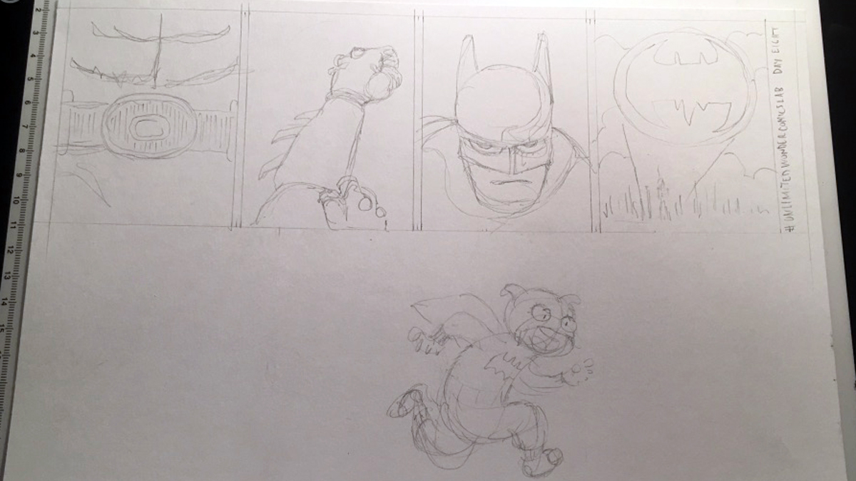
unlimited wonder comics lab january challenge continues with day 8 prompt: pajamas i think the only panel here that i love is panel 4 with the bat – signal. the rest are just ok. inking is hard. i want to keep my ink lines loose and energetic, but inking seems to demand precision. maybe tomorrow’s…
-
unlimited wonder comics lab 2021 day 7
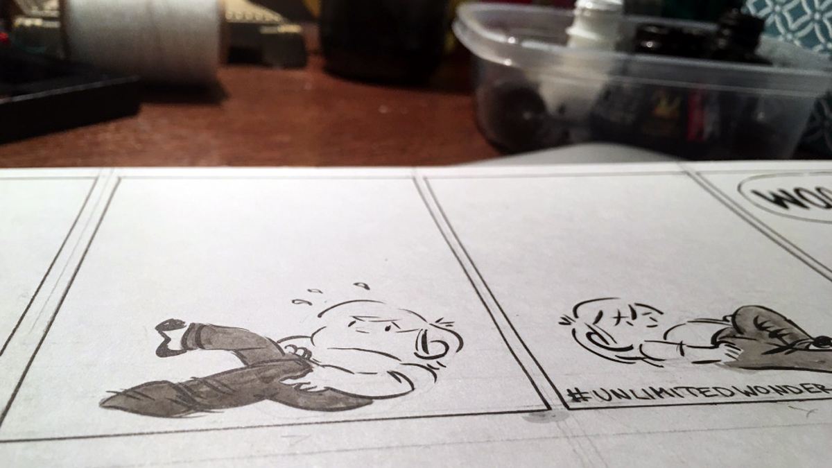
unlimited wonder comics lab january challenge day 7 prompt: woo hoo! i’m piggybacking on the day 6 prompt pants. it saves me a little time, and it’s fun.
-
unlimited wonder comics lab day 6

day 6 prompt: pants. i’m running behind but still plugging away on unlimited wonder comic‘s january challenge decided that i needed to bring more attention to the pants, so i added an ink wash.
-
unlimited wonder comics lab 2021 day 4 (& 2 again!)

combined days 2 & 4 of the unlimited wonder comics lab january prompt list into today’s strip. full disclosure: i’ve never seen the harry potter movies. and only read the first book
-
unlimited wonder comics day 3

day 3 prompt: lava i struggled with the inking of this one. and i don’t feel like i really did the lava justice here’s the pencils
-
unlimited wonder comics lab 2021 day 2

today’s prompt from the brilliant unlimited wonder comics: babysitter. this comic is only half done. i’ll revisit it for the punchline on day 4. happy new year:)
-
unlimited wonder comics lab day 2021 day 1

unlimited wonder comics is presenting a series of prompts for the month. day 1 prompt: moose
-
inktober 2020 day 23

rip If you’re just discovering us today, please visit all of my Star Trek Themed Inktober Comics here. You’ve probably noticed that I’ve modified my posting schedule to every other day. This means my Star Trek themed Inktober will continue sometime into November. With day 23’s prompt, ‘rip,’ we have the return of the Gorn,…
-
inktober 2020 day 3

Bulk Prompt: bulk. That leads me to bulkhead. I looked at a lot of pictures of bulkheads on memory alpha. I looked at a lot of pictures of bulkheads for boats on the internet. I’m still not sure what a bulkhead is. But Kirk ran into it. Inktobers Past You can visit (or revisit) my Zelda…
-
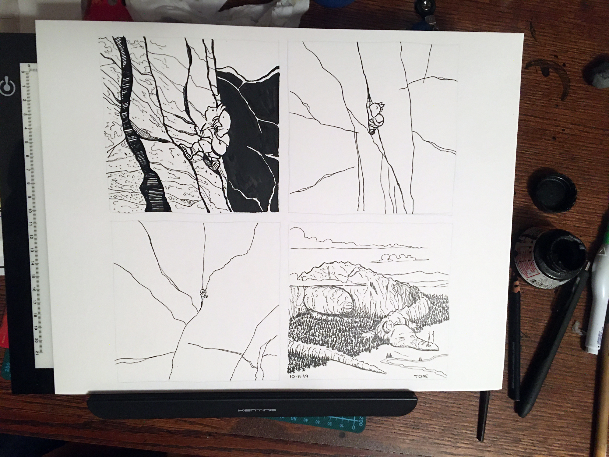
september sketchbook

I’ve talked about this before, but at the start of every month I start a new sketchbook. This month’s sketchbook happened to be one of those mead composition books that comix artist Lynda Barry loves. So in honor of that, I’ve been filling it up with comix. I divide the page up in to 4…
-
collaborating with kieron gillen

Honestly, that’s a woefully misleading title. Grabby, though, ain’t it? In January, comics writer Kieron Gillen teamed up with Project Art Cred to write a script, release it to any artist that wanted it, and bask in the wide variation in storytelling that resulted. You can check out the results that resulted here. Amongst all…
-
inktober day 15 legend

inktober and linktober 2019 continue with day 15: legend. as you probably noticed i’m behind. and skipping around. inspiration for the giant book that link consults is the lindsfarne bible, which i’d never heard of before doing the research for this strip. this is the first day this year that i used a wash. i…
-
inktober day 12 dragon
inktober and linktober 2019 continue with day 12: dragon made some changes to the way i worked on today’s inktober and it really helped. the final piece looks more like i imagined. here’s how it went down. (if you find this sort of thing just mindnumbingly boring, here’s the color version, colored digitally, of today’s…
-
inktober day 11 snow

inktober and linktober 2019 continue with day 11: snow i’m pulling a swerve and giving day 10 a miss because i have an idea for pattern that i need a little more time on. so here’s today’s: it works a lot better in color the way i drew these snowflakes makes them look like potato…
-
inktober and linktober day 9 swing
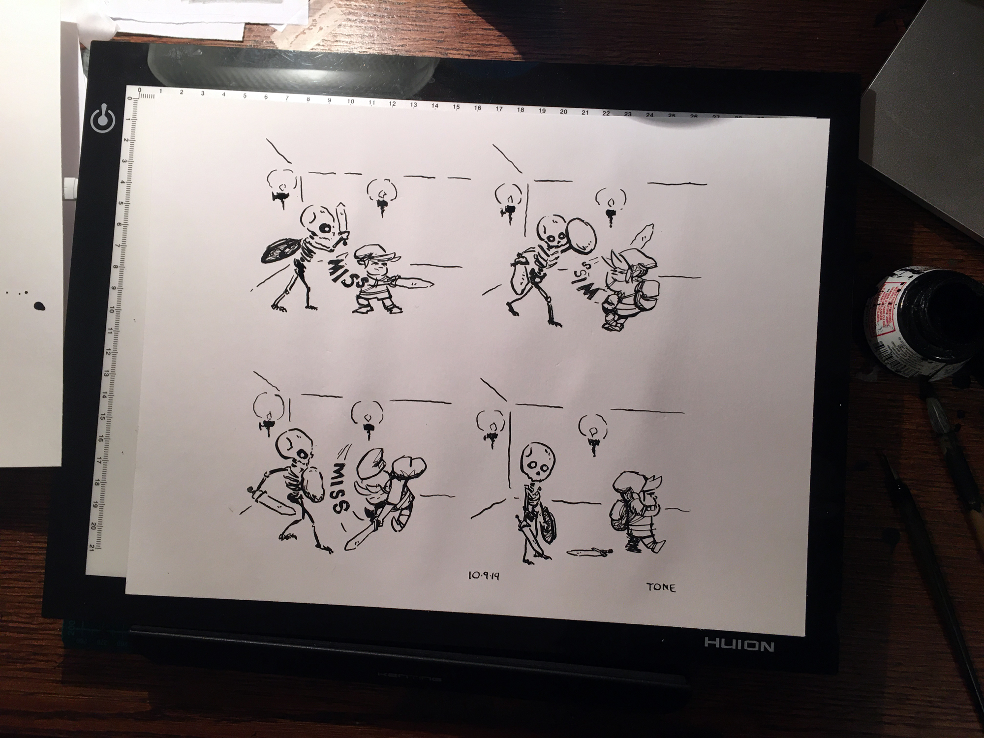
inktober and linktober 2019 continue with day 9: swing (i know it’s the 10th. i’m behind.) i also did a digital color version lately i’ve been doing the sketch digitally, and inking over that here’s the sketch my sketches are better than my inks, but i guess that’s the whole point of inktober, right? i…
-
inktober and linktober 2019 continue with day 8 – frail

inktober and linktober 2019 continue with day 8: frail view the color version, where color reveals a little more information about one of our characters… forgot to ink in her boots, and squandered link’s pose in panel 2, but this effort felt much stronger than day 7’s the main thing i need to remember when…
-
inktober and linktober 2019 continue with day 7 – enchanted

inktober and linktober 2019 continue with day 7: enchanted
-
inktober and linktober 2019 continue with day 6 – husky
inktober and linktober 2019 continue with day 6: husky as i continue to struggle with the drawing of day 5: build, i’m moving on to day 6. only a day late. for all of you inktober purists out there, here’s today’s strip in glorious black and white if you’d like to see the comic in…
-
inktober and linktober 2019 continue with day 4 – freeze

inktober and linktober 2019 continue with day 4: freeze can you spot what link is missing in panel 3? seems like i forget to draw something every day. i didn’t have any ideas going in to fit the the prompt, but i read about the freezors, and once i started getting the pencil moving the…
-
linktober continues – inktober 2019 day 2: mindless

linktober continues jake parker’s inktober 2019 official prompt: mindless penciled this piece 2 days ago felt less than confident about it inked it late last night after my soccer game hated it. told myself i’m going to throw it out in the morning in the morning i looked at it again and accepted it. (after…
-
inktober 2019 is here
jake parker’s inktober 2019 is here! and i’m pretty excited because i’m adding a few wrinkles to make the challenge of doing an inked drawing every day even more challenging for me here’s the deal, coming at you in 4 parts: inktober 2019 part 1: the theme if you’ve been following the blog the past…
-
illustrating a comics page
Here’s a one-page comic I recently illustrated called the ‘The Origin of The Amazing Spider-Foo’. It’s a Spider-Man parody written by Crhymes; a writer, comedian, and musician based out of San Diego. From Script to Rough Layout Originally conceived of as a one-page 12 inch by 12 inch record insert, Crhyme’s script was a brillliant…
-
freelance comic panel
been busy doing freelance – a one page spider-man parody called spiderfoo here’s a timelapse video of the final panel coming together